Well, I’ve certainly never seen anything like that.
Blue Jays Look To Past For New Uniforms
Friday, the Toronto Blue Jays unveiled their new uniforms, and they look a lot like the franchise’s original togs of 35 years ago. Which in this case is a great thing.

Friday at exactly noon Eastern Standard Time, the Toronto Blue Jays began a ceremony introducing their new livery, available for purchase immediately and seen on the field next spring.
Twenty-seven minutes later, the program ended, but not before three new jerseys, a new game cap, and new batting-practice jersey and cap had been unveiled, and modeled by seven actual Blue Jays. Oh, and there was this little mini-film.
The spectacle was astounding, but the bottom line is this: the new livery is a huge improvement over the old livery, which was widely considered the worst set of uniforms in Major League Baseball.
Here’s the new standard home uniform, modeled by Jose Bautista. Note the old-school Blue Jay, complemented by the red maple leaf.

You can't really see it here, but BLUE JAYS is depicted in "split lettering," another nod to the early days of the franchise. The logo on the cap seems a tad large, but I think that was done with the idea of making Jose Bautista's ears seem smaller; my guess is the logo will be down-sized upon Bautista's departure from the club.
Here's Adam Lind sporting the road livery, with a better look at the split-lettered font:

And finally, the alternate set, modeled by Ricky Romero:

The Baltimore Orioles have just shifted from ornithologically correct Icterus galbula to maniacally happy cartoon Oriole.
This is not a good thing.
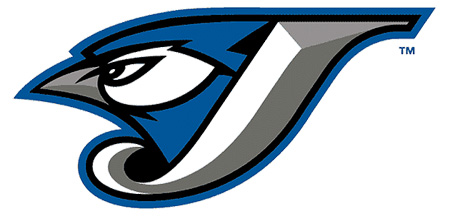
Fortunately, the Toronto Blue Jays have balanced the Universe by switching from maniacally angry cartoon Blue Jay to a somewhat ornithologically correct Cyanocitta cristata.
This is a good thing.
What’s better is that the Jays have gone from an overly stylized, trying-too-hard set of uniforms to something that’s more elegant, with distinct nods to the franchise’s history and its place as Canada’s sole Major League Baseball team.
As always, we might quibble with a few details -- those big split-font numbers on the back? no socks worth showing, at all? -- but the bottom line is that baseball games featuring the Toronto Blue Jays will be more aesthetically pleasing in 2012 than they were in 2011.
If you’re a Blue Jays fan, or if you watch as much baseball as we do, this is reason for celebration.
See More:


