
As you have no doubt heard, the NHL revealed new designs from Adidas on Tuesday night in Las Vegas. And now it’s time to judge them all!
Let’s get happy or angry together about every new NHL jersey design
All of these are great. All of these are bad.
You can compare each to their original designs here. Overall, I personally liked most of them. But scanning the hockey web today proves not all are pleased. I’ve tried to channel my own positive reactions and the internet’s anger into one post of quick hot takes.
The Fantastic

Why you should love it: I heard the people clamoring for a return to the old Avs uniforms. I didn’t really buy into it. Plus, I’m a huge fan of their alternate jerseys and wouldn’t mind seeing those as the new primaries.
Until last night. I forgot how well that light blue works with the burgundy. It’s beautiful, and vaults Colorado back into the top rung of hockey jerseys.
Why you should hate it: N/A
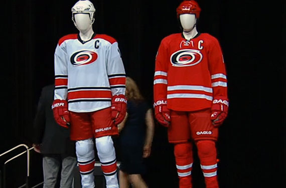
The Good

Why you should love it: Carolina sacrificed some personality when they underwent redesigns recently. I didn’t know I missed the black or the warning flag striping so much until I saw these. These new threads aren’t nearly as busy as the originals they hearken back to, making this a significant upgrade.
Why you should hate it: It’s different than it was before even though I hated those jerseys.
Vegas Golden Knights

Why you should love it: I think Vegas did very well here. Steel-grey is an underrated jersey color that really lets the gold and red and logo pop. Plus, look at the details:
Why you should hate it: hockey in Las Vegas will never work, man

Why you should love it: No piping. No piping. NO PIPING.
Why you should hate it: it’s not different enough
The Fine

Why you should love it: I was down on these until I read the details:

Devils.NHL.com
When it comes to NHL jerseys, nods to franchise, city, or regional history and culture get me every time. I’m not entirely sold yet, but the justifications here are enough to win me over for now.
Why you should hate it: it’s different

Why you should love it: Didn’t like these at first. Why are teams suddenly copping the Montreal chest stripe?
The thing that saves it, for me, is the red trim on the arms. this is good. Not great. But good.
Why you should hate it: bring back the North Stars

Why you should love it: I was really hoping they’d do the right thing and switch to these full-time. Beggars can’t be choosers, though, and no piping at least makes these look a lot neater.
Why you should hate it: liberals, right guys
The Meh

Why you should love it: Two reasons. Slight reasons. They’re less busy:
And they retain the nods to Tennessee I love so much: the guitar numbers, the guitar pick logo and the piano keys on the collar.
But overall it seems a little bland.
Why you should hate it: conservatives, right guys

Why you should love it: If they weren’t going to completely overhaul one of the meh-est jerseys in the league, the least they could do was clean it up a little. Make it a little slimmer. They did that. Yay.
Why you should hate it: it’s actually about ethics in video game journalism
The Basically The Same

Why you should love it: Maybe it’s just that image, but does the blue on the elbows seem a little brighter to you? If so, a good minor tweak.
Why you should hate it: nobody wants to play in Winnipeg lolol

Why you should love it: If you already like their jerseys from before, I guess?
Why you should hate it: NAFTA, imo

Why you should love it: See above.
Why you should hate it: phil kessel is lazy and eats hot dogs

Why you should love it: If you hate laces, congratulations! Those are gone.
Why you should hate it: the everglades are dying

Why you should love it: St. Louis already sported one of the best jerseys in the league. Hard to mess this up, and they didn’t.
Why you should hate it: these jerseys are unworthy of The Best Fans In Baseball™

Why you should love it: Teal is a good color and light orange makes an even better complement. These are the same jerseys.
Why you should hate it: ACTUALLY, more people die from failed Stanley Cup runs than shark attacks each year

Why you should love it: Like the Blues, hard to mess this up.
Why you should hate it: go flyers

Why you should love it: Can’t tell the difference at a glance which is a good thing for these threads.
Why you should hate it: go penguins

Why you should love it: A beautiful shade of blue. And way more blue than they’ll actually look on the ice, for some reason. A conspiracy.
Why you should hate it: Henrik Lundqvist is too beautiful

Why you should love it: there is
Why you should hate it: nothing to see here

Why you should love it: Simple. Classic. Gorgeous.
Why you should hate it: Si Jonathan Drouin n’est pas la deuxième venue de Guy LaFleur, nous le renvoyons à Tampa Bay en bas de la côte dans un conteneur d’expédition fabriqué à partir de poutine.

Why you should love it: Unlike most, I like the Kings’ logo. But I like their grey Stadium Series alternates better.
Why you should hate it: The Kings play boring hockey and therefore I hate them.

Why you should love it: The same as last year’s redesign, unsurprisingly.
Why you should hate it: more of a dog person

Why you should love it: Why change what ain’t broke?
Why you should hate it: hey did you see that the Lightning stole our jer—

Why you should love it: Low-key one of the best jerseys in the NHL. Fight me.
Why you should hate it: Hockey will never work in Arizona.
Sincerely,
Desperate, lonely Quebec City citizen

Why you should love it: Ben Affleck is a good Batman, IMO.
Why you should hate it: Mark Wahlberg

Why you should love it: Lovable underdogs. Great sweater. Great city. (2007)
Why you should hate it: Chicago wins too much, I hate them (2017)

Why you should love it: I’ve been told there was a change here. I don’t see it. That’s okay, though, because I like these.
Why you should hate it: have you noticed i complain about a lot of things
Dallas Stars

Why you should love it: I said last night these jerseys were overrated. I forgot how much that green pops. Glad they didn’t change anything.
Why you should hate it: it’s because i am a hockey fan
The Ugly

Why you should love it: Orange jerseys are, in general, bad. We are not deer hunting. We are hockeying. At least these pictures indicate the orange next year won’t be as bright or harmful to the eyes as the Oilers of recent memory.
Why you should hate it: I am 80 percent passionate about the game and 20 percent passionate about complaining about almost anything about the game. Bickering with fans of my own team is almost as normal as bickering with opposing fans. I will bicker with anyone. The NHL isn’t what it once was back in the day or even last year.
I have automatically renewed my season-ticket package again. It cost too much.

Why you should love it: Obviously still an upgrade over their previous jerseys, but that logo ... ugh.
Why you should hate it: I, hockey fan, love hockey but you can’t always tell because I seem to hate on so much of it and people around it all the time. Why won’t you love hockey with me? Is it because of the instinctive negativity you feel from all of us?

Why you should love it: I put these in the “ugly” category as a placeholder. The Reebok versions always looked a little busy and cluttered. Until we see these on the ice, it’s hard to judge for sure.
Why you should hate it: Well ... maybe I could try to be more positive. Maybe then you’ll like hockey, too.
See More:


