This morning, a few coworkers of mine suddenly realized the Atlanta Hawks logo is ... a hawk.
The Atlanta Hawks’ Pacman, and other logos people see totally wrong
If you failed to see the bat in the Batman logo, please identify yourself.

Jason Getz-USA TODAY Sports

via SportsLogos.net
If you view the logo in its inverse, it looks kinda like an elderly Pacman spitting out his tooth. This is a known phenomenon, so much so that the logo and its original ’70s version are affectionately known as “Pacman.”
I can totally see how someone might make that mistake with a logo that incorporates only two colors. Flip the positive and negative space and you see something totally different. Talking about this brought up more examples. The one that dumbfounded me most was my coworker Alex admitting that he failed to see the bat in the “Batman” logo for most of his childhood:
Squint and focus on the upper or lower yellow region, and you might see it, too. It’s like a set of long, flappy gums or strangely round teeth. To my surprise, Alex isn’t alone in this:
But now I can promise you’ll never be able to un-see the mouth:
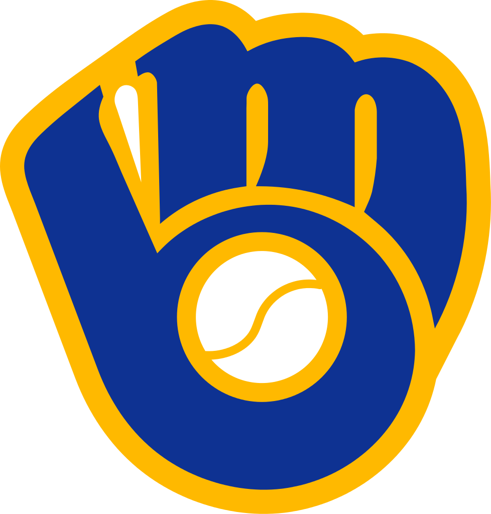
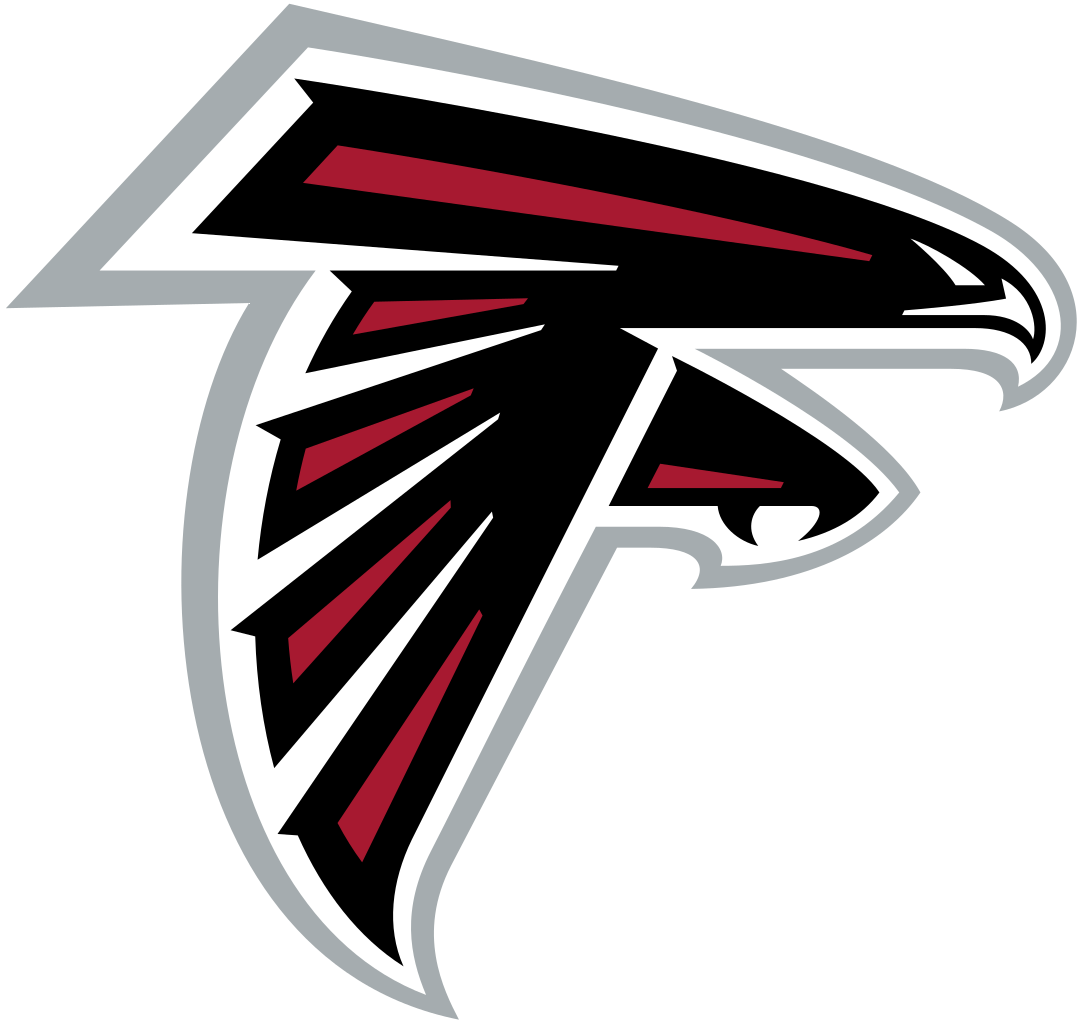
So now my question is: What other familiar logos have the potential to trick the mind like this? I’m not talking about intentionally hidden, secondary representations, which are found all over sports — the Brewers glove logo is an “mb,” the Falcons logo is an “F,” the Tostitos logo includes people dipping chips, the FedEx logo has an arrow in it, etc. Those are all clever logos meant to be read a few different ways by a sharp eye.
This is different. This is people interpreting non-information in logos as information, to the point that they miss the obvious thing the logo actually represents. The Batman logo is not supposed to be a mouth. The Hawks logo was not meant to be a Pacman.
For example, it took me until about 10 years ago to see the Prudential logo as a big rock ...
... instead of a misshapen howling wolf:
I dunno, man. I think it’s just a matter of your eye catching the wrong color in something the first time you see it. Like, if you miss it the first time, this could easily be some sort of abstract swirly design instead of a cat head:
Or this:
I prefer this interpretation of the X-Men logo:
And this:
... and ... I guess we’ve gotta excuse this one, too:
I want to hear more. What logos — sports or otherwise — have you misinterpreted? Again, we’re not talking about missing hidden or secondary information. I’m talking about completely failing to see THE thing a logo is supposed to represent.

