The NHL hasn’t had an expansion in 17 years, when the Blue Jackets and Wild were added back in 2000. Now, months after November’s announcement that the Vegas Golden Knights would be joining the league next season, we finally know what they’ll look like when they take the ice in October.
Let’s rank the NHL expansion draft jerseys from the last 25 years
Las Vegas is the NHL’s first new team in 17 years. Let’s celebrate by ranking some jerseys from the most recent expansion era!

You know what that means, friends. It’s time to bring back the ever popular jersey rankings! Since Las Vegas is just one team, we’re going to put them up against the last 25 years of expansions. Only the first jersey worn by that team will count, because everyone starts somewhere.
That’s, by my count, 15 teams including relocations. So, I’ll stop talking and get right down to it! All the images, minus Las Vegas’, come from the wonderful NHL Uniforms. Want to kill a few hours of your day? Go get lost on their expansive website.
15. Nashville Predators, 1998

Before the Predators got their gorgeous primarily yellow look, we got these. The gray on the sleeves and the triangle behind the white jersey’s logo show what these late-1990s designers believed the future would have looked like. Sadly, it’s just too out there.
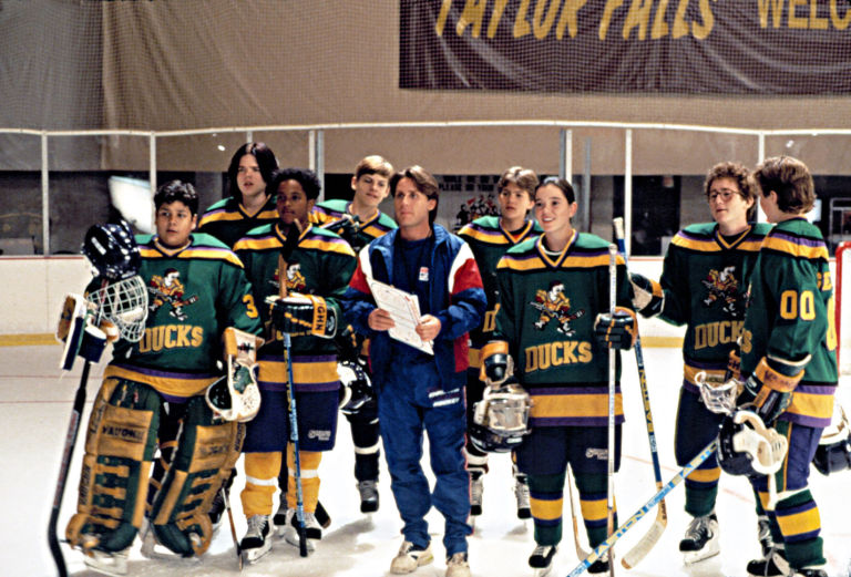
11. Mighty Ducks of Anaheim, 1993

The fact that the shade of purple the Mighty Ducks used is called “eggplant” should be reason enough to rank them so low. Cutting players off at the mid-torso with the diagonal color block is a pretty bad offense though. Honestly, a big reason this jersey fails to impress is because it isn’t an exact replica of the movie jerseys. Now that is a classic.
10. Tampa Bay Lightning, 1992

I really, really love this shade of blue. However, I am not a fan of the logo — which uses too much white space — or the mostly black look, especially with that 3D lettering on the back. Only the Kings have really pulled off a black jersey well, and someone else on this list.
7. Colorado Avalanche, 1995

Colorado’s look hasn’t really changed much since 1995. What they did get rid of, however, is the best feature of their first jersey: the mountain-shaped color blocking. Unlike the Mighty Ducks, the blocking makes sense! And it’s a pretty flattering cut as well.
Lucky for us, the Avalanche brought this style back in the new Adidas re-design!
5. Vegas Golden Knights, 2017

I think fifth place is good for the newest member of the NHL. It’s not as risky as the ones higher on this list, but I think this jersey does the job for the Golden Knights. The textured pattern on the gold adds something special to this jersey, which looks better in white than gray after prolonged exposure.
Even still, the blocked pattern reminds me of what so many people loved about the Team North America jerseys from the World Cup of Hockey that I can’t help but get extremely excited to see these on the ice for the first time in Vegas.
4. Florida Panthers, 1993

This is such a quintessentially 1990s look. Big, bold colors that feel right at home next to that paper cup you always had at outdoor gatherings. I almost want to dislike it on that principle alone, yet it works? I’m not sure how it’d stand up in the NHL today, where everything is more muted, but I get such joy from these jerseys.
3. Atlanta Thrashers, 1999

By now you should know, I reward taking chances. That’s what the Thrashers did here on their first jersey and I love every bit of it. It’s a crime Atlanta went to the powder blues when they had such great style working for them. That colored jersey especially is a look. I know we had the Thrashers for such a short period of time, but it’s a shame we never saw that secondary logo get more use.
2. Phoenix Coyotes, 1996

Remember how I said the Kings weren’t the only ones to master the black jersey? Phoenix and their Cubist Coyote look is something that would never work 99 times out of 100, yet this one combination they got right. The layout of the color blocking draws you right into the best detailed piping job in the history of the NHL and then into the logo. Overall it makes for one fascinating, and quite stunning, jersey.
1. San Jose Sharks, 1991

The Sharks threw back to these beauties last season. Teal is a unique color in the NHL and San Jose does it right. That silver and white touch along the bottom are really missed in the Sharks current uniforms. It’s a super sharp look, one the Sharks should keep around. Simplicity and beauty at its finest.
See More:


