The Super Bowl XLV logo is unique, in that it will now forever be the same. Starting with Sunday’s big game, the new logo, prominently featuring the Lombardi Trophy, will essentially be the exact same design every season -- the only parts that will change will be the Roman numerals and the stadium backdrop.
Super Bowl XLV Logo: 2011 Design Ushers In New Era With Cowboys Stadium
“It’s a unique mixture of icons that represents what this whole thing is all about. It’s well done,” said Bill Lively, the president and CEO of the North Texas Super Bowl XLV Host committee. “We’ve approached our mission not just for 45 but for many, many [Super Bowl] games to come.”
In 2011, the new design features Cowboys Stadium circling around the Lombardi Trophy. Next season, the logo will incorporate Lucas Oil Stadium as the backdrop.

This means that on Sunday, we will officially say goodbye to the Super Bowl logos of the past. Let’s pay those from the past decade their proper respects.
![]()
The logo from 2010’s game, which featured small touches to the host city, Miami, will now forever be the last unique logo. Remember it fondly.
![]()
The good news in the NFL’s decision to make the design uniform is that we no longer have to worry about attempts at 3D-looking logos.

Looks like something you’d see on the side of a cheap motel in Arizona.
![]()

This belonged with the other Super Bowl logos from the 1980s.

This was legitimately a great job at incorporating the local host city -- the logo is sprawling and includes a bridge.

![]()
This looks like some odd conglomeration between the old New York Islanders logo and the Gorton’s Fisherman logo.
![]()
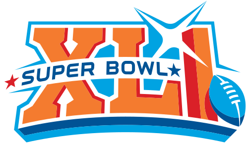
One of the better Super Bowl logos, really.

See More:


.svg)